Tag Archives: fonts

Links of Interest, 26 April 2015

A few links to get us through the weekend!

I have a moderate font-collecting addiction. Dafont is my go-to source of high quality free fonts, but I’ll pay money for the right font. Remington Typewriter is probably one of the right fonts, and it’s very inexpensive over at DtRPG for four weights, depending on how short of ink you want your typewritten text to look. Great for player handouts, props, or other documents for pulp gaming or anything WW1/WW2/early 20th C!

Dinosaurs are always pulpy, and now Antediluvian Miniatures are doing some models based on the really early concepts of what dinosaurs were thought to look like. No fast, sleek, feathered raptors here, these are big chunky cold-blooded alligator-y critters, and they look great.

Having wandered into playing Infinity a few months back, I’ve started finding and following Infinity-related blogs. Bleached Models has some good stuff, including this really nicely illustrated tutorial on blending and layering colour.

Ending on a Russian Civil War related note, the Russian-language page AviArmour has a page about the Armstrong-Whitworth armoured car with some interesting text (in Russian, but Google Translate will give you the basic idea) and some great period photos of Armstrong-Whitworths in action. Would have been nice to find that page while I was working on my own 28mm A-W from Copplestone a couple of years ago! Lots of interesting information on AviArmour, it’s well worth a browse.

Terrain, Fonts and other Links of Interest, 13 April 2012

To celebrate (?) this fine Friday the 13th, another of my occasional posts of links.

Muskie commented on my Youtube scenery videos post to remind me of his fascinating Miniature Painting News Aggregator, which has a neat collection of feeds from all over the place, mostly focused on miniature painting but touching on a number of other hobby elements too. The aggregator apparently started as a private project, and it’s a bit GW-centric for my personal tastes, but it can throw up some neat semi-random content. Well worth a visit, and well worth bookmarking for return visits. (Incidentially, I”ll also recommend Muskie’s Better Hobby Blogging article for those of us who blog. Full of good advice.)

We talk about design, fonts, Inkscape and related topics fairly regularly here on The Warbard, and I’ve just discovered the Lost Type Co-op, a pay-what-you-want font foundry with lots of very nice Art Deco-influenced fonts and others suitable for Interwar/Early 20th C design efforts.

Further on the design and graphics front, Fantastic Maps is, well, fantastic. Jonathan Roberts also has a great collection of Tips & Tutorials that is well worth checking out.

Last but definitely not least, the Barking Irons site has a nicely illustrated Witchlands Hovel tutorial by Tony Harwood. The Witchlands are Flintloque’s version of Russia, and Tony’s article should provide inspiration for plank-roofed rural buildings for Russia and elsewhere.

In fact, I’m going to get off this computer, get some food, then start cutting coffee stir sticks for my own version of a plank-roofed hut!

Pulp Design Tools & Resources, Part Three: Inspiration

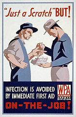
Infection Is Avoided...
A 1930s WPA job-safety poster. Via x-ray_delta_one on Flickr.

A necessarily brief, personal and idiosyncratic tour through some websites with noteworthy archives of 1920s/30s posters, postcards, luggage tags and other graphics. Some photos, some stuff that’s technically outside our chosen era but still cool, and far too short, but enjoy, be inspired, and get a feel for the graphics of the pulp era!

Part One of this series introduced Inkscape. Part Two talked about design, typography & fonts.

The American Library of Congress WPA Posters collection, part of their American Memory project, is huge but not that easy to navigate. Start with the Collection Highlights tour, then just start hitting random keywords or subjects to find gems like Yellowstone Park posters, injunctions to clean up your trash, and even hippos. The WPA was the Works Progress Administration, part of the whole New Deal aimed at keeping Americans employed and maintaining national morale during the Great Depression. There was a whole wing of the WPA dedicated to encouraging the arts, including the graphic arts. Hence the really cool posters.
Continue reading Pulp Design Tools & Resources, Part Three: Inspiration

Pulp Design Tools & Resources, Part Two: Fonts

This is the second in a series of posts (three or more) aimed at introducing gamers to some of the resources out there they might not be aware of for making their own graphics & such. It’s based on our current areas of interest, the 1920s & 30s interwar pulp period, but should be of interest to anyone wanting to add some graphic design details to their gaming!

Part One was a general introduction to Inkscape.
Part Three is on online sources of pulp/interwar design & other images.

A Quick Intro to Some Pulp Design Basics

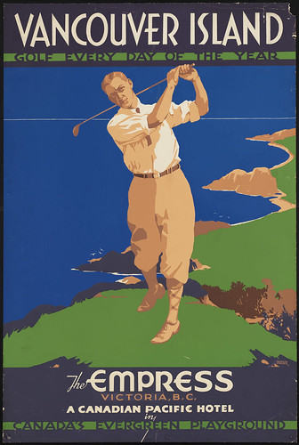
van isl golf poster
A 1930s Canadian Pacific poster for the Empress Hotel. Via Boston Public Library's Flickr account (CC BY-NC).

Have a look at the image to the right; it’s a good basic distillation of the design principles shared by many of the 20s/30s graphics we’re trying to replicate for our own uses. There were, of course, a number of different styles and variants in use in the period, this one just happens to be a favourite of mine and also easy to replicate in Inkscape!

There’s no gradients, just areas of solid colour. Shading is done with smaller areas of another solid colour — see the area along the golfer’s inner thigh or around his arms — or not done at all. Notice that the grass and sea are simply solid colours; the sea and sky are even exactly the same shade of blue, with the horizon sketched in with a thin tan divider. No outlines or sketch lines, either, just areas of colour.
Continue reading Pulp Design Tools & Resources, Part Two: Fonts

Pulp Design Tools & Resources, Part One: Inkscape

Everytime Corey or I post player aids, faux-vintage ads, building signs, faux magazine covers or similar to forums or elsewhere, there’s always people curious about the tools, fonts and resources we use.

This is the first in a series of posts (probably at least three) aimed at introducing gamers to some of the resources out there they might not be aware of for making their own graphics & such.

Part Two on fonts, typography & design has been published now.

Inkscape

The main tool is Inkscape, an amazing Open Source vector-graphics editor. It’s free to download, available for Windows, Linux, or Mac, and quite possibly the coolest program ever.
Continue reading Pulp Design Tools & Resources, Part One: Inkscape