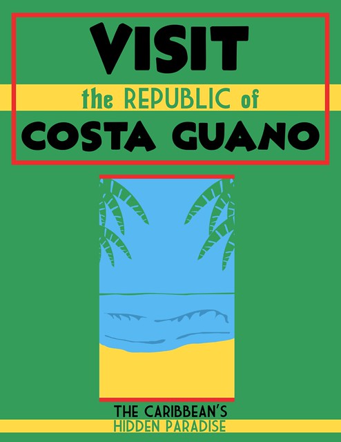
Visit the Caribbean’s Hidden Paradise, Costa Guano! (View Larger on Flickr by clicking the image)
More pulp graphic lunacy via Inkscape and the peculiar inside of my skull. This time it’s a travel poster to that oft-forgotten tropical hellhole paradise, The Republic of Costa Guano, which with it’s various neighbours will, eventually, form the background for some pulp/Banana Wars games and pulp adventure lunacy.
“Costa Guano” is, I think, a name originally used in a Joseph Conrad novel I haven’t actually read, but it’s too good a joke to pass up. Pulp steamers and their adventuring crews on the swampy coasts; exiled gangsters and foreign agents skulking in the fetid, dangerous capital Montón De Guano; Lost Worlds in the unmapped jungle-shrouded interior; Banana Wars and uprisings… all these and more are possibly taking place right now in exciting Costa Guano. Book your zeppelin ticket from Miami (with stopover in Havana) today!
There’s a 22 page set of demo rules which include the full movement, combat, wound, vehicle, explosive and flying rules, as well as enough Archetypes to build some characters and teams to test the new shiny out.
There’s also a draft copy of the 2nd Edition Special Abilities PDF, with a good selection of the skills & special abilities that’ll be available in 2nd Ed.
More later perhaps when I’ve had a chance to look it over properly and build a character or two! Short version is that I like what I see, lots of streamlining and good tweaks to an already great system.
Full release of the rules is pencilled in for mid-March, apparently.
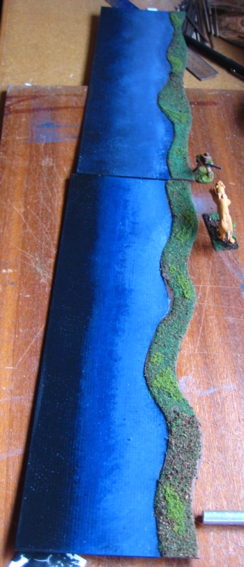
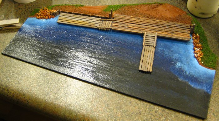
Two feet of riverbank/shoreline, the original two from summer 2009. On the right, a 28mm hunter and a 28mm sabre-tooth tiger on a 20mm by 40mm base. Click for full-size image.
These riverbanks or shorelines made from picture-framing board (mattboard). I did the first set back in 2009 and another batch in the winter of 2010. They’re designed to form one edge of a playing board, especially on the 2’x2′ playing areas common to .45 Adventures. One of the really nice things about games like 45A that encourage smaller playing areas is that terrain projects become a whole lot more managable — no more having to crank out eight feet of river just to have enough to be usable on the table! Each segment is 12″ (1 foot) long and 5″ deep, 4″ of river and 1″ of banks. The banks are the same mattboard as the rest, to keep them as low-profile as possible. The painting is black and two colours of blue, damp-blended right on the card. I tried to keep the edges mostly matched while painting the pieces. The water portions then got about six or so coats of acrylic gloss varnish so they looked like water. If I was going to paint them again, I’d do the water areas a greener shade with less black, as is often seen in murky jungle rivers.
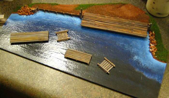
The docks in place on the new riverbank section. Click for full-sized version.
In the winter of 2010 I added two new segments to the set, one another copy of the existing riverbank pieces, and the second incorporating a ramshackle wooden dock. The dock segment was wider than the others for most of the length, although obviously the same width at the ends. The docks were built up with baswood planks, with toothpicsk and bamboo skewers for the piilings. The large dock section is glued to the base; the three smaller sections are freestanding for flexibility.
The riverbank dock section, showing the freestanding dock segments. Click for full-size verison.
All four sections have been largely free of warping or damage, although the docks section does havea tendency to bow when stored. The eventual plan is to rebuild these riverbank sections in 2mm or 3mm MDF, using a bandsaw to cut the curves, but mattboard will do until then!
(these photos have been seen over on the Lead Adventure Forum and elsewhere previously, if you’re thinking they look a bit familiar…)
WordPress 3.1 has some very shiny new updates – Gallery style now works properly (I couldn’t get it working before, could well have been user error…) and several things are easier than they used to be!
Another revival from the old Brian’s Wargame Pages version of the site, and one that I should have brought forward ages ago! You can see the Esquimalt Drydock on Google Maps for a sense of scale that wasn’t available ten years ago when I first posted the photos. — Brian, 22 Feb 2011
In the summer of 2001 I was roommates with a guy who worked in the drydock here in town. He turned into a real asshole after being laid off, but while he was still working he gave me a tour of the yard. I brought my camera, and these pics should inspire people looking for new industrial modern or SF scenery projects!
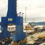
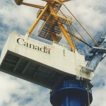
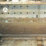
One thing that would be very difficult to reproduce on the gaming table, except maybe in 6mm, would be the sheer scale of the place. I didn’t have my wide-angle lens with me, so I didn’t even try for some real area photos. The drydock itself is 1100 feet long; the two big cranes pictured below are several hundred feet tall. There were two fair-sized ships in the drydock when I was there, and they could have accomodated a third with no difficulty. And this isn’t even that big a drydock, by maritime engineering standards. The ones that can accomodate nuclear-powered aircraft carriers are even bigger…
Wargamers interested in industrial scenery or future-tech industrial landscapes (Necromunda style) should find plenty of inspiration here! Even if you can’t reproduce the scale, the clutter, details and fixtures should provide some ideas.
Click any image below for a (slightly) larger view. Keep in mind these are refugees from the Old Web, when 600px wide was a Big Image.
The blue-and-yellow tower in the centre is one of the two massive cranes; this photo is also impressive for the amount of clutter visible!
One of the massive cranes alongside the drydock; the two big cranes are similar, but the details differ.
Workshops, office cubicles, supplies and random equipment and parts compete for space alongside the drydock. Great, colourful clutter for scenery ideas – lots of cover for skirmishers.
When they need to section off the drydock, the big cranes lift these huge steel bulkheads into the dock. For scale, those yellow railings along the top of the photo are about waist-high on a person.
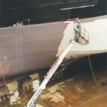
Ships are big too – this guy is spray-painting the primer along the hull of that Russian deep-sea fishing boat. The travelling lifting-basket truck he’s working in actually looks pretty cool too.
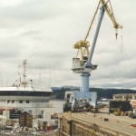
The pale blue crane is the second very large one at the yard; the ship at centre is a Russian deep-sea fishing boat in for overhaul. Again, lots of clutter and stuff filling the place up…
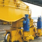
The two big cranes ran on these massive railroad-style track assemblies. To give you an idea of the scale here, each of those big blue cylinders (brake machinery) are about five feet tall. (1.5m or so) These are seriously large machines….
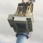
The other crane. Made by Krupp of Germany, at least in part.
Note: These signs are Brian’s work from the old Warbard. One day they may be recreated in Inkscape and SVG — Corey
This zip file contains two very detailed, 1200dpi images in Adobe Photoshop PSD format, with lots of varied industrial & safety signs to decorate your industrial scenery and buildings.
Each image is roughly 3×3 inches. Print onto standard paper – or the lightest paper your printer can handle – and cut out and glue onto your scenery. A few of these on a nice piece of industrial machinery or factory wall really make a piece ‘pop’ – after all, real industrial sites tend to be plastered with signs, notices and warnings. (The actual images are MUCH more detailed than the little sample image here!)
As usual, these are free to download, print or modify for personal use.
Update, 8 Aug 2020: I’ve just confirmed that these old (from sometime in 2001!) PSD files can be opened just fine in the current version of GIMP. Not bad for files nearly twenty years old!
A 1930s WPA job-safety poster. Via x-ray_delta_one on Flickr.
A necessarily brief, personal and idiosyncratic tour through some websites with noteworthy archives of 1920s/30s posters, postcards, luggage tags and other graphics. Some photos, some stuff that’s technically outside our chosen era but still cool, and far too short, but enjoy, be inspired, and get a feel for the graphics of the pulp era!