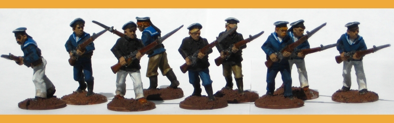
Part of the reason I haven’t done much painting in the last several months has been the frankly depressing state of my painting bench. It had progressed beyond cluttered to “under there somewhere”, and when sitting down to paint would involve first moving crap out of the way with a shovel, one naturally loses the inclination to attempt any painting…
So this evening I bit the bullet, actually did take a shovel to the bench, then sat down to reclaim some space from my ever-increasing collection of paints. There are all sorts of great paint racks and storage systems out there (this fairly recent system from Back2Bas-ixs, for example) but they all cost more than I want to spend; my wargaming budget isn’t huge and I’d much rather spend that on figures, rules and scenery! So I grabbed a shoebox lid, some extra scrap card from another box, and a roll of masking tape, and set about building a functional mockup of a paint rack.
Here it is, in all it’s cardboard glory:

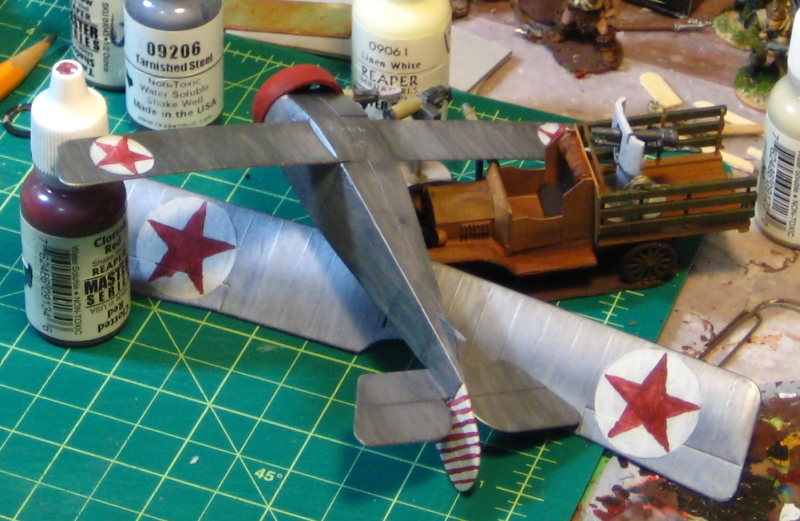
The first thing I realized is that I’ll need at least one more that size to get my existing collection of paints fully up off the bench itself, but this is a start! The shelves are box cardboard slightly heaver than the card the shoebox is made of, and there’s a cardboard “toe” at the lower edge to keep it propped against the wall at a slight backwards angle to keep everything on the shelves. It holds 24 Reaper dropper bottles (the same size used by Vallejo or Foundry) and the two lowest shelves hold 10-12 GW/Tamiya-sized jars.
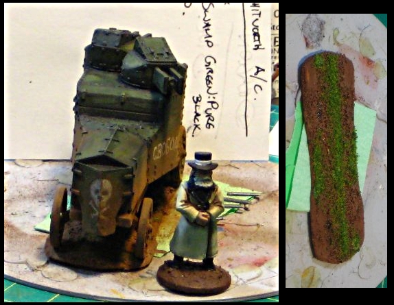
I’m calling it a mockup because one of the things I want to build is a much larger shelf/rack system that goes across the whole back edge of my painting bench, with lots of shelving for paints, inks, tools and in-progress figures. I can get thin acrylic sheet (ie plexiglass) fairly cheaply from a local plastic supply shop, so part of the reason for this quick-and-dirty shoebox shelf is to see what sort of proportions that project will have. (just for scale, the cutting mat at front centre of my bench is a 12″x9″ model.)
In the meantime, I’m going to scare up a second shoebox lid and bodge together another quick-and-dirty paint shelf for the rest of my paints and inks!