Tag Archives: Inkscape

Russian Civil War Blinds

A number of the TooFatLardies games, including Through The Mud And The Blood, feature “Blinds” — markers used on the table at the start of the game to disguise the exact location and composition of your force and introduce some fog-of-war elements with a minimum of bookkeeping.

RCW Blinds
A quick screenshot of the two styles of RCW Blinds

Richard of TFL recently put out a PDF with a couple of generic blind markers to support his recently released I Ain’t Been Shot Mum, 3rd Edition WW2 rules — they’re on the TFL Yahoo Group, assuming you’re a member. They’re rather elegant oval markers, designed to print about 6″ wide and 4″ deep.

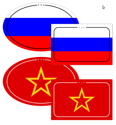
These inspired me to fire up Inkscape last night and create blinds for the Russian Civil War forces I am building for Mud & Blood. There’s ovals very much like the IABSM ones, and on the second page of each PDF is a pair of rectangular blinds, which are much less elegant but likely a lot easier to cut out! You could, for added elegance, use a round-corner punch on the corners of the rectangular ones; this is likely what I”ll do with the ones I print.

You can download both letter-sized versions for North America and an A4-sized version for the rest of the world. They’re tiny PDFs, two pages each but under 6Kb in file size.

Feedback below, especially if you have any suggestions for other blinds you’d like to see! I’m already planning Union Jack blinds for my British forces, for example.

Jurassic Pulp II: Rex Stomps Back!

Back in October 2009, near the beginning of this pulp craze of ours, I ran a game I called “Jurassic Pulp”, inspired by that T Rex vs SUV chase scene in the original Jurassic Park movie. We used Model Ts instead of SUVs, though, and they’re just a bit more fragile than a modern SUV. T Rex hasn’t changed, though!

A fairly complete report on that first game can be found over on Lead Adventure, including some post-game ideas from both Corey and I.

When we were kicking ideas around for a new .45 Adventure convention game, the idea of reviving Jurassic Pulp came up. I’ve started to run with it, Continue reading Jurassic Pulp II: Rex Stomps Back!

An Egyptian Souvenir

OK, I’ve never actually been to Egypt. But it’s a classic in pulpish destinations (and the closely-related Lovecraftian/Cthulhuian destinations!) and while I’m obviously biased, I like how this luggage tag or sticker has come together.

Egypt! The Mysterious Near East! &c &c. Done in Inkscape, as always!

Done in Inkscape, as usual. The design occurred to me while walking home from work one afternoon, and pretty much fell together once I got home and fired Inkscape up. I love it when inspiration strikes like that!

The Caribbean’s Hidden Paradise!

costa guano poster
Visit the Caribbean’s Hidden Paradise, Costa Guano! (View Larger on Flickr by clicking the image)

More pulp graphic lunacy via Inkscape and the peculiar inside of my skull. This time it’s a travel poster to that oft-forgotten tropical hellhole paradise, The Republic of Costa Guano, which with it’s various neighbours will, eventually, form the background for some pulp/Banana Wars games and pulp adventure lunacy.

“Costa Guano” is, I think, a name originally used in a Joseph Conrad novel I haven’t actually read, but it’s too good a joke to pass up. Pulp steamers and their adventuring crews on the swampy coasts; exiled gangsters and foreign agents skulking in the fetid, dangerous capital Montón De Guano; Lost Worlds in the unmapped jungle-shrouded interior; Banana Wars and uprisings… all these and more are possibly taking place right now in exciting Costa Guano. Book your zeppelin ticket from Miami (with stopover in Havana) today!

Pulp Design Tools & Resources, Part Three: Inspiration

Infection Is Avoided...
A 1930s WPA job-safety poster. Via x-ray_delta_one on Flickr.

A necessarily brief, personal and idiosyncratic tour through some websites with noteworthy archives of 1920s/30s posters, postcards, luggage tags and other graphics. Some photos, some stuff that’s technically outside our chosen era but still cool, and far too short, but enjoy, be inspired, and get a feel for the graphics of the pulp era!

Part One of this series introduced Inkscape. Part Two talked about design, typography & fonts.

The American Library of Congress WPA Posters collection, part of their American Memory project, is huge but not that easy to navigate. Start with the Collection Highlights tour, then just start hitting random keywords or subjects to find gems like Yellowstone Park posters, injunctions to clean up your trash, and even hippos. The WPA was the Works Progress Administration, part of the whole New Deal aimed at keeping Americans employed and maintaining national morale during the Great Depression. There was a whole wing of the WPA dedicated to encouraging the arts, including the graphic arts. Hence the really cool posters.
Continue reading Pulp Design Tools & Resources, Part Three: Inspiration

Pulp Design Tools & Resources, Part Two: Fonts

This is the second in a series of posts (three or more) aimed at introducing gamers to some of the resources out there they might not be aware of for making their own graphics & such. It’s based on our current areas of interest, the 1920s & 30s interwar pulp period, but should be of interest to anyone wanting to add some graphic design details to their gaming!

Part One was a general introduction to Inkscape.
Part Three is on online sources of pulp/interwar design & other images.

A Quick Intro to Some Pulp Design Basics

van isl golf poster
A 1930s Canadian Pacific poster for the Empress Hotel. Via Boston Public Library's Flickr account (CC BY-NC).

Have a look at the image to the right; it’s a good basic distillation of the design principles shared by many of the 20s/30s graphics we’re trying to replicate for our own uses. There were, of course, a number of different styles and variants in use in the period, this one just happens to be a favourite of mine and also easy to replicate in Inkscape!

There’s no gradients, just areas of solid colour. Shading is done with smaller areas of another solid colour — see the area along the golfer’s inner thigh or around his arms — or not done at all. Notice that the grass and sea are simply solid colours; the sea and sky are even exactly the same shade of blue, with the horizon sketched in with a thin tan divider. No outlines or sketch lines, either, just areas of colour.
Continue reading Pulp Design Tools & Resources, Part Two: Fonts

Pulp Design Tools & Resources, Part One: Inkscape

Everytime Corey or I post player aids, faux-vintage ads, building signs, faux magazine covers or similar to forums or elsewhere, there’s always people curious about the tools, fonts and resources we use.

This is the first in a series of posts (probably at least three) aimed at introducing gamers to some of the resources out there they might not be aware of for making their own graphics & such.

Part Two on fonts, typography & design has been published now.

Inkscape

The main tool is Inkscape, an amazing Open Source vector-graphics editor. It’s free to download, available for Windows, Linux, or Mac, and quite possibly the coolest program ever.
Continue reading Pulp Design Tools & Resources, Part One: Inkscape

One Week Until GottaCon & “Amulet of Fire”!

Next Friday GottaCon 2011 opens here in Victoria, and a week today, Saturday the 5th, is my pulp adventure game, “The Amulet of Fire”.

I’ve just finished the Encounter Cards for both Acts of Amulet. Here’s a few of the possible Encounters for Act One, “The Missionary Position”:
AoF Act One cards
Continue reading One Week Until GottaCon & “Amulet of Fire”!

Old Signs for your Pulp Gaming

Old Signs for Pulp Gaming

Inspired by my brother’s Fake Pulp Adverts post, I thought I would share one of my projects. Over the past few weeks I have been working on a series of old signs for pulp-era 28mm gaming. Designed for any era from the 1900’s to the 1940’s and in any part of the English-speaking world, these signs are fairly versatile.

You can also download the PDF version (Old Signs for Pulp Gaming) if you want a vectorized copy for scaling. As usual, these are designed in the superlative Inkscape, an Open Source vector editing program. The fonts used largely come from DaFont, which has a large set of free and Open Source fonts for use.

Where did the idea come from? The initial inspiration was this image of a locksmith shop in Winnipeg by one of my Flickr contacts:

Old locksmith shop in Winnipeg. Picture by rpaterso

After that I started to dive into the Shorpy image archive and came up with some gold. Images such as the one below are great for mining for re-creation:

Old Corner Bookstore: 1900 on Shorpy

The files are currently licensed for non-commercial, personal use, largely because not all the fonts used allow commercial publication.