Tag Archives: graphic design

Terrain, Fonts and other Links of Interest, 13 April 2012

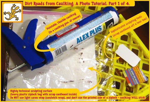
To celebrate (?) this fine Friday the 13th, another of my occasional posts of links.

Muskie commented on my Youtube scenery videos post to remind me of his fascinating Miniature Painting News Aggregator, which has a neat collection of feeds from all over the place, mostly focused on miniature painting but touching on a number of other hobby elements too. The aggregator apparently started as a private project, and it’s a bit GW-centric for my personal tastes, but it can throw up some neat semi-random content. Well worth a visit, and well worth bookmarking for return visits. (Incidentially, I”ll also recommend Muskie’s Better Hobby Blogging article for those of us who blog. Full of good advice.)

We talk about design, fonts, Inkscape and related topics fairly regularly here on The Warbard, and I’ve just discovered the Lost Type Co-op, a pay-what-you-want font foundry with lots of very nice Art Deco-influenced fonts and others suitable for Interwar/Early 20th C design efforts.

Further on the design and graphics front, Fantastic Maps is, well, fantastic. Jonathan Roberts also has a great collection of Tips & Tutorials that is well worth checking out.

Last but definitely not least, the Barking Irons site has a nicely illustrated Witchlands Hovel tutorial by Tony Harwood. The Witchlands are Flintloque’s version of Russia, and Tony’s article should provide inspiration for plank-roofed rural buildings for Russia and elsewhere.

In fact, I’m going to get off this computer, get some food, then start cutting coffee stir sticks for my own version of a plank-roofed hut!

The Russian Civil War at Trumpeter Salute

Sent off my request for a table to run a Russian Civil War game at Trumpeter Salute 2012 over in Vancouver (March 30, April 1 & 2, for those interested!), using the excellent Through The Mud & The Blood rules from TooFatLardies, of course.

I’ve got a pretty good handle on the painting of 50+ White Russians and nearly 70 Reds. The Whites have turned out to be more fun to paint than I thought, as they had some very individualistic units running around, and the habit of wearing items of dress uniform into the field where they could. Pygmy Wars has been a huge help in this regard; if you’re into RCW at all that site is a goldmine of information, and written by a wargamer so it’s far more focused on gamer-friendly information than other sources! I also have a couple of more colourful Red units, so not everything colourful on the table will be White!

As I’ve done in the past, because my mind can work in odd ways, I’ve started a poster (possibly a magazine cover?) for the game. I’m not entirely happy with the current version, although I think the basic idea (a map burnt through, basically) is sound enough. The Devil, as always, is in the details, and those aren’t right yet. Nevertheless:
easposter_draft

Templates for Cards

Because I happen to have a stockpile of them around the place, several years ago I started using pre-punched Avery business card sheets as gaming cards – Encounter Cards and vehicle cards in .45 Adventure, stats sheets for minor characters, more recently the Russian Civil War initiative cards for Mud & Blood. Even if you haven’t got pre-punched sheets around, the 2×3.5″ size is easy to use and handle printed onto ordinary cardstock and cut out.

There is of course a Microsoft Word template available right off Avery’s own website but I created my own templates from scratch in Inkscape, first because Word is a lousy program for actual graphical work, and secondly because the Avery templates are set up with vertical (portrait) orientation of the sheets, while for most gaming cards having a landscape setup makes more sense.

Accordingly, I kicked Inkscape to life, took some measurements from the Avery sheets and from their template and created a new template with the cards set up on a landscape (horizontal) sheet, which makes laying the cards out like small playing cards much easier.

I’ve uploaded three versions for people to use: a PDF version, a PNG version (probably the most generally useful) and finally, for those of you who have taken up Inkscape, an SVG version, which is in a ZIP file as WordPress doesn’t like SVG,

If you’re not sure which version to use, grab the PNG version, any modern graphics program should read PNG. Most should also be able to import PDF, which might get you a more accurate template.

CC0 To the extent possible under law, Brian Burger/Wirelizard Design has waived all copyright and related or neighboring rights to Card Template Blanks (various file formats). This work is published from: Canada.

The little grey block basically means that whoever downloads these can do whatever they like with them, including use them in commercial products. Go nuts. And if you’re from that rather large part of the word that doesn’t use Letter-size paper, sorry, but you’re going to have to come up with your own templates!

RCW Cards & Blinds In The Flesh

Finally got around to printing and cutting out a full set of the Russian Civil War Mud & Blood cards I created a few weeks ago, as well as the earlier Blinds.

Here’s the full set spread over my painting desk.

rcw_cards
They actually exist! Printed versions of the cards and blinds I’ve created for playing Russian Civil War games with Through The Mud & The Blood.

You can, of course, find the PDFs for the cards and the blinds in earlier posts here at The Warbard, so you can print your own.

Corey and I will be doing our second session of RCW M&B today (Sunday) at our regular games club meeting up at the local university. Game reports and possibly photos here, as usual.

Unofficial .45 Adventure 2nd Edition Character Sheets

These are my unofficial draft versions of character sheets for Rattrap’s .45 Adventure 2nd Edition; they use a vaguely period typewriter font for a somewhat pulpish look, and while the layout is still a work in progress they take up less space than the 1st Edition sheets.

.452e sheets thumb
Part of the Grade One character sheet.

The PDF is 3 pages; there’s two Grade 3 & 2 characters per page and six Grade 1 spots.
Download the PDF right here (73Kb).

Feedback, suggestions or comments below in the comments area, as always!

(Legal Garble: .45 Adventures is copyright Rattrap Productions. These sheets are copyright Brian Burger/Wirelizard Design, permission granted to copy for personal use only.)

Jurassic Pulp II: Rex Stomps Back!

Back in October 2009, near the beginning of this pulp craze of ours, I ran a game I called “Jurassic Pulp”, inspired by that T Rex vs SUV chase scene in the original Jurassic Park movie. We used Model Ts instead of SUVs, though, and they’re just a bit more fragile than a modern SUV. T Rex hasn’t changed, though!

A fairly complete report on that first game can be found over on Lead Adventure, including some post-game ideas from both Corey and I.

When we were kicking ideas around for a new .45 Adventure convention game, the idea of reviving Jurassic Pulp came up. I’ve started to run with it, Continue reading Jurassic Pulp II: Rex Stomps Back!

The Caribbean’s Hidden Paradise!

costa guano poster
Visit the Caribbean’s Hidden Paradise, Costa Guano! (View Larger on Flickr by clicking the image)

More pulp graphic lunacy via Inkscape and the peculiar inside of my skull. This time it’s a travel poster to that oft-forgotten tropical hellhole paradise, The Republic of Costa Guano, which with it’s various neighbours will, eventually, form the background for some pulp/Banana Wars games and pulp adventure lunacy.

“Costa Guano” is, I think, a name originally used in a Joseph Conrad novel I haven’t actually read, but it’s too good a joke to pass up. Pulp steamers and their adventuring crews on the swampy coasts; exiled gangsters and foreign agents skulking in the fetid, dangerous capital Montón De Guano; Lost Worlds in the unmapped jungle-shrouded interior; Banana Wars and uprisings… all these and more are possibly taking place right now in exciting Costa Guano. Book your zeppelin ticket from Miami (with stopover in Havana) today!

Sci-fi Signage

Note: These signs are Brian’s work from the old Warbard. One day they may be recreated in Inkscape and SVG — Corey

This zip file contains two very detailed, 1200dpi images in Adobe Photoshop PSD format, with lots of varied industrial & safety signs to decorate your industrial scenery and buildings.

Each image is roughly 3×3 inches. Print onto standard paper – or the lightest paper your printer can handle – and cut out and glue onto your scenery. A few of these on a nice piece of industrial machinery or factory wall really make a piece ‘pop’ – after all, real industrial sites tend to be plastered with signs, notices and warnings. (The actual images are MUCH more detailed than the little sample image here!)

As usual, these are free to download, print or modify for personal use.

Update, 8 Aug 2020: I’ve just confirmed that these old (from sometime in 2001!) PSD files can be opened just fine in the current version of GIMP. Not bad for files nearly twenty years old!

Pulp Design Tools & Resources, Part Three: Inspiration

Infection Is Avoided...
A 1930s WPA job-safety poster. Via x-ray_delta_one on Flickr.

A necessarily brief, personal and idiosyncratic tour through some websites with noteworthy archives of 1920s/30s posters, postcards, luggage tags and other graphics. Some photos, some stuff that’s technically outside our chosen era but still cool, and far too short, but enjoy, be inspired, and get a feel for the graphics of the pulp era!

Part One of this series introduced Inkscape. Part Two talked about design, typography & fonts.

The American Library of Congress WPA Posters collection, part of their American Memory project, is huge but not that easy to navigate. Start with the Collection Highlights tour, then just start hitting random keywords or subjects to find gems like Yellowstone Park posters, injunctions to clean up your trash, and even hippos. The WPA was the Works Progress Administration, part of the whole New Deal aimed at keeping Americans employed and maintaining national morale during the Great Depression. There was a whole wing of the WPA dedicated to encouraging the arts, including the graphic arts. Hence the really cool posters.
Continue reading Pulp Design Tools & Resources, Part Three: Inspiration