I don’t spend a lot of time rummaging around on Youtube, so up until recently I’d missed the immense amount of wargaming material there, especially terrain & scenery tutorials. A lot of the model railroad techniques are really too fiddly (or the resulting scenery too fragile) to really work for wargaming, but there’s lots of wargaming terrain vids and some great ones from the model railroaders that’ll work nicely on the wargaming table.
This might be old news to some of you, but I thought I’d link to a couple of good ones I found. Who knows, this might become a semi-regular feature here.
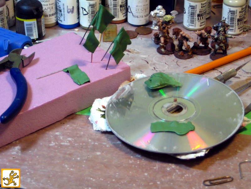
How to make your own clump foliage.
A machine for making bottlebrush trees. These look good and should be solid enough for wargaming.
From the same guy, how to make pine trees, a variation and expansion of his bottlebrush technique. He also has hedges with another variant of the same bottlebrush technique.
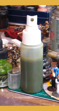
Another YouTuber with lots of good video tutorials is RubbishInRubbishOut of Australia. Here’s his useful Making “Goop” for basing wargaming scenery and terrain, basically a mix of caulking, water, glue and sawdust or sand for texture to quickly add ground texture. He’s got a bunch of other good videos too, well worth checking out.
(I’ve avoided embedding the videos in this post quite deliberately. Half a dozen embedded vids can lock up older computers quite nicely, and the embedding always gets broken on Tabletop Gaming New’s blogroll and other RSS feeds anyway. Go watch the vids on YouTube, they’re worth it!)